Create an effective & meaningful quiz
Step 1: Brainstorm & Plan
CHOOSING A TOPIC
Everyone knows you need a way to engage your audience. The most popular option lately is a value-packed opt-in. While creating my new website, I decided to deep-dive into what I could offer that would provide the most value to my audience. I knew that I didn’t want a ‘throw-away’ pdf that people would save next to the 4839284239432 other freebie downloads they’ve collected. I wanted something that would provide value right away. That meant that I needed to make the experience of my opt-in be valuable in itself, so I could leap over the ‘I’ll do it later' hurdle of those that were actively engaged with me.
My audience includes creatives that have found their passion and want to begin building profit from that passion by establishing an unforgettable, consistent brand image. By attracting this group of people, I’ve met with clients that have so recently found their passion, that investing in a designer is a few too many steps ahead of where they’re currently at in their business. As an example, one client came to me for a full brand suite without a set brand name in mind…
having a goal / purpose
There are some important questions you need to be able to answer before you can effectively translate your vision to a third party (in this case, a designer) and get results that exceed your expectations. I don’t want to waste the time of these people that are newly discovering their passion by doing the disservice of taking on their project before they’re really ready. In order to a) help my audience determine if it’s time to hire a designer and b) filter out clients that may not be ready for my services, while providing value and advice for their new journey.
Step 2: Build-Out
initial SET-UP
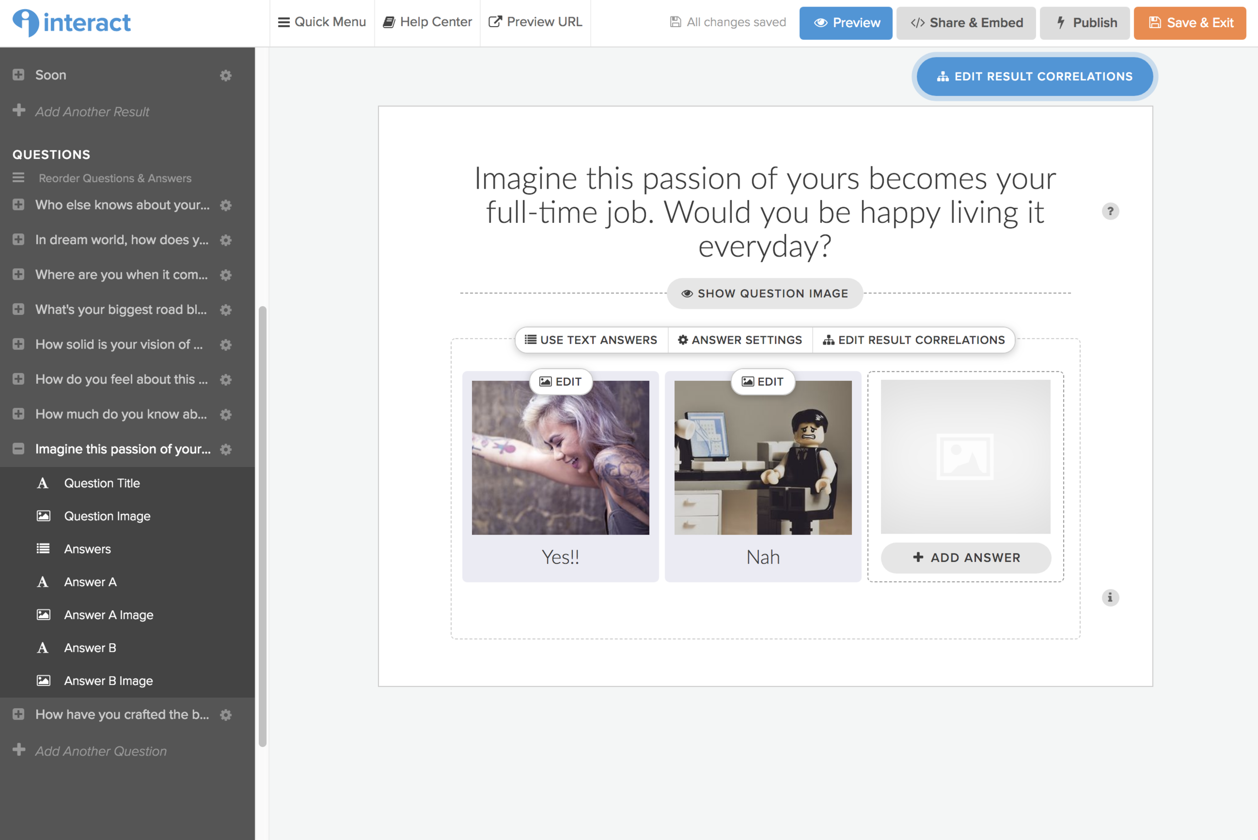
Interact has an awesome amount of free templates you can build your quiz off of. This is an awesome starting place for you if you’re new to creating quizzes. When choosing a template, you can narrow your search by type of quiz and industry (as shown in screenshot) which really helps key into a set-up similar to your specific needs. A template gives you a peek into how things should be set up on the backend of your quiz, without sticking you in a box (you can still edit all content and styling)!
I came up with my questions and answers before actually putting anything into the quiz software. That way, I knew which answer combinations would result in which results. This is key to choosing the correct template / set-up for your quiz.
You also get the choice of basic ‘Quiz Type’. This is an essential decision for your quiz to have the proper structure and flow to accomplish exactly what you need it to do! (Another reason why planning ahead is key!) Note that while you can edit questions and answers, you cannot change the base quiz ‘type’ after your initial selection. That’s why it’s key to know exactly how you’d like things set-up before diving into set up.
EFFECTIVE QUESTIONS
To come up with my questions, I pictured myself sitting next to a potential client. What would I ask to see if they were really ready to work with me? What would I need from them to be able to provide my services? How should they feel about their business in order to get the most out of working one-on-one with a designer?
Since this quiz was not only meant as a way to help people know if they’re ready to hire a designer, but also filter out customers that are not ready to make the leap, I focused on assessing their feelings and attitude towards their passion / potential business. To keep things fun and interesting, I included a few questions with ‘image answers’. This helped translate ideas and feelings quickly while maintaining an extra level of engagement.
QUALITY ANSWERS
Going back to my mental image of meeting with a potential client, I considered what the various ways the conversation could go…
They could: a) be soooo ready to hire a designer and dive head-first into their passion b) be on the fence, but ready to get started so we could potentially start with a small project together to get them started with little investment or c) need a bit more discovery before investing in design services.
I had a few people review my quiz before going live tell me that I shouldn’t tell anyone they aren’t ready, as that would essentially be turning away a customer. While this could be seen as a negative, I viewed it as a way to filter out clients that were not in the right headspace to appreciate the time and money investment working with me would entail. It’s important to me that the people I work with believe in what they’re putting into the world. That way, I can create impactful visuals that sing to that passion.
CALL-TO-ACTION(S)!
I created 3 unique call-to-actions, one for each possible result. If someone is super ready to do this, I invite them to look over my services to see if we could be a good fit together. If someone is somewhat ready / close to being ready, I suggest reviewing my low-entry, smaller service. And if someone is not ready to make the leap, I invite them to book a consult call with me to discuss their ideas further. I understand that some people may still be passionate, but unsure of how to get into the right mindset. If interested in building on their passion, I’d still love the chance to talk one-on-one with them to see where their head is. Chatting with a designer and voicing their questions and concerns may, after all, lead to a new customer! If not, maybe I could be the encouraging words for them to dive deeper or refine their idea before making a financial investment with a designer. I created my quiz as a way for people to realistically gauge where they’re at with their passion project. Through my quiz, I provide my genuine input on their next best steps, without forcing them into a service they may not be ready for.
Step 3: Implement & Review
INTEGRAtIOn
To make the most of leads coming through my quiz, I chose to integrate my ConvertKit account. Quiz takers are prompted to enter their email to view their results - and these emails are saved to my subscriber list. A quick and easy to way to keep track of potential customers that may be on the fence of working with a designer. Interact also allows you to segment your list so that people that get certain answers will receive certain email sequences! All pretty awesome for telling the exact story you want and show you listen & care about the results people are getting!
share
I chose to feature my quiz on the homepage of my website. After clicking the FIND OUT button, visitors are redirected to a page on my site to take the quiz (with no other distractions!). I also posted on Instagram to drive traffic.
Analyze
Interact includes a tonnnn of information on how things are converting and the results that people are getting. You can view data on leads generated (email sign-ups), answers to specific questions, total number of views, how long people spend on each question, and more! This step is honestly as detailed as you’d like it to be. I’m not a huge data fan, but I can see how someone could totally geek out with all the amazing insight you receive.
One awesome tip is to review how long people are taking to actually take your quiz and how long they spend on each question. This can help you determine how seriously they were taking it and allows you to evaluate the value of each specific lead.
Should you make your own quiz?
Overall, quizzes are a great way to draw people in and engage with your brand! I’d highly suggest them to anyone looking for a way to gain insight into their audience’s mindset. Make sure to build a quiz that will be beneficial to both you and the quiz taker. Also, be sure to do the leg work before building so that your questions & answers are thoughtful and produce helpful results for you to work with. Interact has a ton of tools to make things the best they can be, but you do need to be sure of the building blocks before structuring your quiz so that everything works right. I suggest planning out with pen & paper before bringing things into Interact. My biggest struggle has been promotion, but that’s due to the fact that I generally scoff at shouting promotions at my audience (definitely a personal challenge I’m working on).
I honestly do believe though that if you build your quiz with the intention of educating and helping out the quiz taker, the eyes & meaningful leads will come.
Want help implementing your quiz and making it look beautiful?
Shoot me an email & I’d be happy to help. kelly@starcastlestudio.com


