Simple 5 Step Logo Audit
Star Castle Studio provides artful entrepreneurs and makers with tips and custom-created visuals needed to beautifully run a professionally branded business and make an unforgettable impression online.
Your logo is the face of your business.
It’s the first impression of what your business is, does, and represents. As a small business owner, you may have come up with something quick to get you by, but how is your logo really working for you??
When you run your own business, it can be hard to step back and view your materials objectively. That’s why I’ve created this simple 5 step logo audit process for you to reflect & access what your logo is really saying about your brand and business.
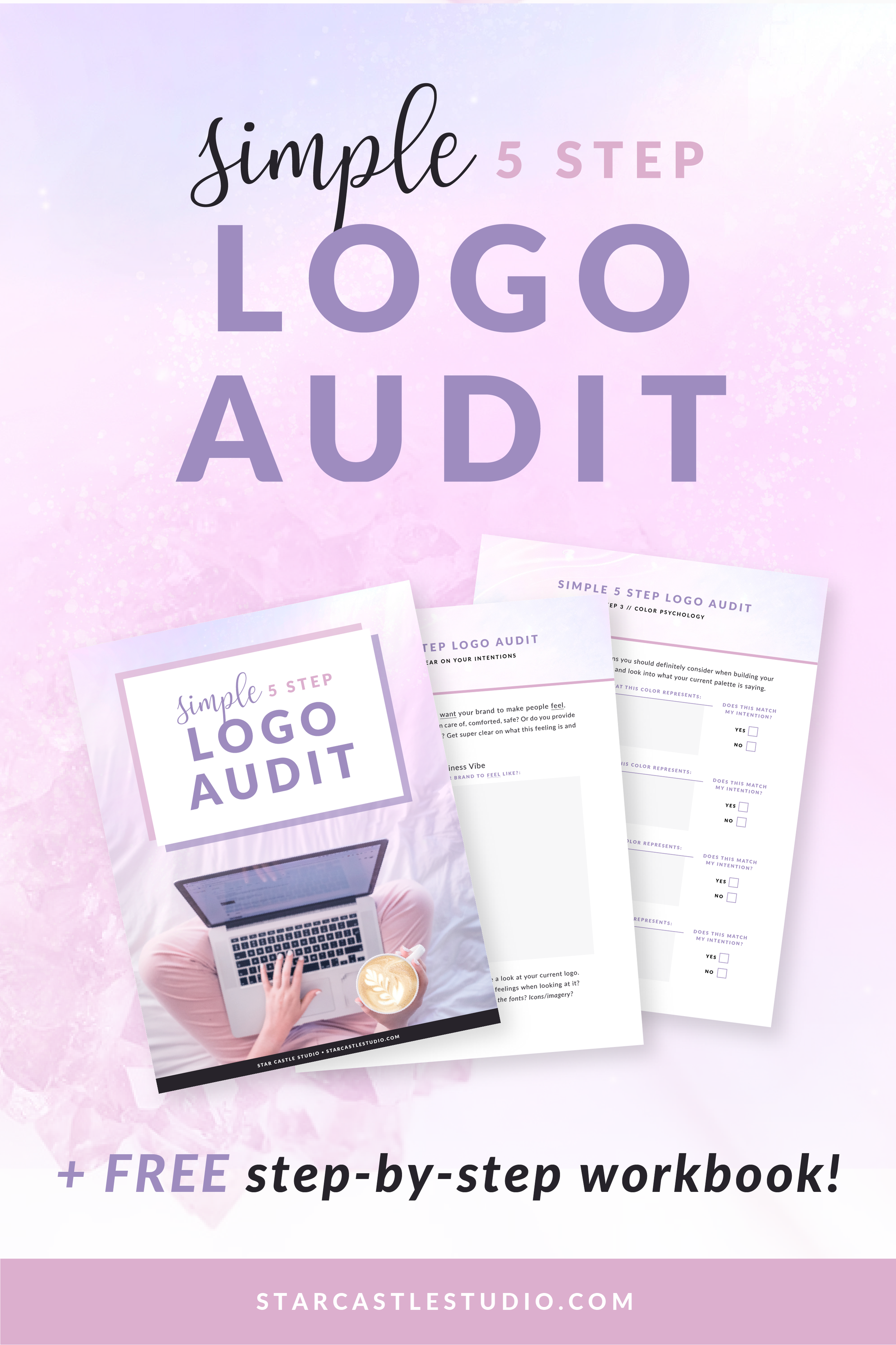
Simply work through the steps below on your own to perform your own logo audit, and/or download my FREE workbook to be walked step-by-step through the process + it also includes an extra sheet for easily gathering insight from others!
step 1: get clear on your intentions
Take some time to consider how you want your brand to make people feel.
Does working with you make them feel taken care of, comforted, safe? Or do you provide a more intense, energetic ‘kick in the pants’? Get super clear on what this feeling is and hold onto it. Let’s call it your business vibe.
With your dreamiest business vibe in mind, take a look at your current logo.
Is there a stark contrast or do you sense similar feelings when looking at it?
Are the colors matching these vibes?
How about the fonts?
Icons/imagery?
Step 2: self reflect
Think of someone you’d love to connect / collaborate with in business.
Picture them seeing your logo for the first time… Are you feeling proud or a little self conscience?
If you feel the tiniest bit of ‘shame’ or embarrassment while doing this exercise, it’s definitely time for a rebrand! It’s important you feel confident sharing your business (especially the visuals of it)!
Step 3: reference color psychology
You don’t have to be a designer to incorporate some color psychology into your branding. While I don’t recommend you dive into the rabbit hole of learning everything about color, there are a few simple associations you should definitely consider when building your brand. Since this is an audit, start with what you have and look into what your current palette is saying.
Using reds? You are (maybe unknowingly) evoking passion, excitement and high energy.
Great for fitness trainers, not so great for meditation studios…
Blues? You’re establishing a sense of comfort, peace and tranquility.
Do the feelings that your current colors portray actually match the intended vibe you have for your brand/business? If not, it may be time to update your color palette!
Step 4: compare with competitors
Place your current logo next to a few of your competitors’ logos.
Competitors, in this case, would be other brands/businesses that have similar offerings and sell to the same, or a very similar, audience as your business.
Be honest, how does it look in comparison?
When your brand is ‘working’ properly, you should clearly feel yours is the best in the bunch. It should look different enough to stand out from the crowd, but still be speaking directly to the same audience. If it’s looking shabby or totally off kilter from the others, get curious as to why and consider how you can polish things up.
Step 5: gather insight from others
It’s important this remains the very last step in auditing your logo. Asking for insight from others can be a bit tricky, as everyone has their own personal preferences and opinions – that may or not be relevant to your audience and business goals. Take everything with a grain of salt, and try to stick to the big picture stuff (like legibility) rather than simple opinions on aesthetic.
Since you undoubtedly know your business name, it’s pretty much impossible to judge legibility objectively. This is why it’s key to ask a few people what they read when looking at your logo. These observers should ideally not know the actual name of your business.
Ask them to read it, and see if the answer aligns.
You may be surprised with the answers you get here! If there’s any part that unreadable, make sure to clean things up so it’s legible!!
Next, ask them to guess what it is your business does / offers.
Did they guess correctly?
If not, you may want to incorporate a subheading, or a simple icon that ties into what you do.
Grab your FREE workbook!
Includes a step-by-step breakdown of my simple logo audit process + a worksheet page to easily gather insight from others!
Lastly: put your logo audit to use!
Once you’ve worked through all 5 steps, gathering info on what your current logo is portraying vs. what you envision for your business – make sure to update whatever needs updating!!
Quick reminder: as your business grows and flourishes, your logo + brand will inevitably need to evolve with it! It’s important to check-in regularly and make sure your logo is resonating with the right people and reflecting how your brand has grown.
While it’s ideal to keep a consistent logo to help establish brand recognition with your audience, there’s no shame in intentionally changing your logo if it no longer suits your brand / business. Go with what feels right, and step confidently into the brand of your dreams!
Realized your logo needs an upgrade?!
Together, we can create a custom logo & build the brand of your dreams (from concept to reality) in less than a week with my accelerated bite-sized branding service!
Or maybe things just need refining to match your flourishing business? I love helping fine-tune brand visuals! Reach out and let’s give your brand the polishing it deserves.


